8 Facebook ad examples to inspire your creativity
Let’s face it – creating the perfect Facebook ad takes a lot of work. If you look at some of the best Facebook ad examples, you’ll realize that to stand out – you have to really test your imagination. With so many brands competing to grab the attention of millions of Facebook users (to give you a perspective, Facebook is earning nearly $67.37 billion in net ad revenues) it makes sense why you need to emphasize on making your Facebook ads captivating and engaging.
However, it’s not always easy to come up with amazing ideas on your own. But inspiration doesn’t have to exclusively come from within. At times, you’ve got to look at what other people are doing to get those creative juices flowing. If you’re currently suffering from a creative block, then keep reading – in this article, we’re going to show you 33 Facebook ad examples to give you the graphic inspiration you need, and a free ad template to kick start the process.
Before we move on to the actual examples, let’s review the different categories of Facebook ads and what makes them special. It might be possible that you’re limiting yourself to one specific category and not exploring other, more creative alternatives. As of now, Facebook lets you create ads in the following formats:
Video ads
As far as social media ads are concerned, video is considered highly effective. In fact, according to one source, the world collectively watches 4.6 billion video ads online every year. That's insane! If you’re thinking of creating a video ad, make sure that you follow these aspect ratios recommended by Facebook for different placements:
- Feed– vertical 4:5
- Stories– vertical 9:16 (full screen)
- Carousel– square 1:1 (keep it consistent throughout the carousel)
- In-stream– horizontal 16:9 (full screen)
Here are some other requirements for Facebook video ads:
- Length– minimum 1 second and a maximum 240 minutes
- Size- maximum 4GB
- Text– not exceeding 125 characters.
- Thumbnail– must include no more than 20% text.
Image ads
These are the most common forms of Facebook ads. Image ads use the power of visually-appealing static posters to grab the attention of users. Do not make the mistake of underestimating the power of art, as it can make or break your ad. In fact, that’s one of the top 5 reasons paid ads fail. If you want a quick way to promote your business online, an image ad is your go-to option. The best thing about image ads is that they’re easy to create. By using certain tools or a Design Pickle designer, you can create a stunning ad, on-the-go.
However, there are certain limitations and recommendations by Facebook which, if followed, can set your image ad up to perform well. Here are those recommendations.
- Format– Facebook only accepts JPG and PNG files for image ads. If you want to use animated GIFs, opt for the video option.
- On-image text– Facebook recommends on-image text to not exceed 20%, which you can check using the same tool mentioned earlier. The more on-image text you add, the less likely it is for your ad to reach its full audience. The point is to make the images seem less spammy.
- Aspect ratios– 1.91:1 to 4:5 for ads without links. If you want to include links, the recommended aspect ratio is 1.91:1 to 1:1.
Check out Facebook’s guide for image ads to learn about other technical requirements.
Collection ads
Video and image ads can only get you so far. When it comes to actually purchasing something, users prefer a seamless experience that lets them browse through your products. This is where collection ads come into the picture. Think of these ads as a mini-catalog for your products. A typical collection ad has:
- A featured image or video.
- Four images of your product(s).
Whenever a user clicks on an ad, they’re taken to a page powered by Instant Experience (which loads in the blink of an eye, by the way) where they can view even more products and the details that matter – like pricing. Collection ads let you create quick in-store experiences for your users who can browse through your offerings seamlessly. They’re highly recommended if you have a wide range of products to promote or simply cannot fit everything into a standard image ad. You can also use collection ads to promote a single product, service, or experience with different images.
Here are some technical recommendations:
- Headline– limited to 25 characters (you could opt for a longer headline but Facebook may cut it)
- Text– limited to 90 characters (again, you could go for longer text
Carousel
Similar to collection ads (as you can see in the Facebook ad example above), carousel ads allow you to add multiple images. Here’s how they’re different:
- You can upload up to 10 different images and videos of your product(s) as “cards”, each with a separate link.
- There is no featured image or video.
- Any card, when clicked, takes users directly to a relevant landing page.
Like collection ads, carousel ads are great if you want to promote multiple products through a single ad. You can add specific details about the products/services/offerings (like price, name, etc.) in their cards. This makes it easier for users to quickly browse through whatever you’re offering. You can also use carousel ads to promote a single product or service, like an app, or, to tell a compelling story. Like any other type of Facebook ad, carousel ads have some technical limitations and recommendations:
- Cards– anywhere between 2 and 10 cards are allowed.
- Images– only JPG and PNG formats are allowed. The size limit is 30MB.
- Videos– make sure that the size doesn’t exceed 4GB. Click here to see the list of supported video formats.
Slideshow ads
If you want to create a video-like ad, but don’t have the budget for it, a slideshow ad is the best option. Slideshow ads are created by merging multiple images. They play seamlessly like video ads, with sound and text. However, unlike videos, slideshow ads load quicker, regardless of the speed of internet connectivity. You also don’t have to worry about compatibility issues. With a handful of images (and in only a matter of few minutes), you can create a captivating story for your brand without having to go through the hassles of shooting, compiling, or editing a video. The technical specifications are the same as video ads.
Instant Experience
Instant experience isn’t a separate category of ads, per se, but rather a Facebook feature that allows you to enhance your ads. Used mostly with collection ads (as discussed earlier), Instant Experience is the name given to visually-appealing, full-screen pages that instantly open up once an ad is clicked on. Unlike standard ads, an ad with Instant Experience doesn’t take the users directly to landing pages. You can either choose from a collection of templates or create a custom instant and immersive experience for your ads. You can use Instant Experience on every type of ad, ranging from videos to carousels. To see the recommended specs, click here.
Best Facebook ad examples to get your creative juices flowing
Without further ado, let’s look at some great Facebook ad examples. We’ll examine a total of 10 examples, broken up into the following categories:
The first example that we want to discuss is this simple image ad by MVMT–a company that sells quartz watches and other accessories. This ad is a perfect representation of the fact that you don’t always need complex graphics or a high video production budget to stand out. At times, all you need is a high-quality image of your product and a simple, concise copy. The images should look professional, in which your products are the heroes (in this case, the watch and the bracelet) – the graphics and the text should only complement them.
To summarize, here’s what we like the most about this ad:
- Image– high quality and professionally shot. It has the perfect balance of lighting and a simple theme.
- Copy– simple, concise, and to-the-point (also goes with the MVMT brand)

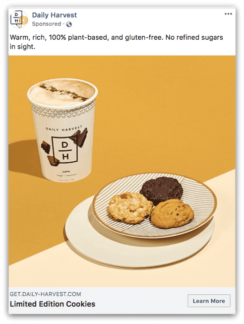
A perfect image ad is one that doesn’t rely on any on-image copy – just the product, some good ol’ photography skills, and the right choice of background colors. This ad by Daily Harvest – a company that sells organic and gluten-free products – is all of the above. The image is attractive enough to make anyone crave their scrumptious-looking cookies and latte. Apart from the image, the top-text includes all of the relevant marketable keywords while the headline, “Limited edition cookies,” is aimed at creating a sense of urgency. All in all, this ad is perfect in every sense.
To summarize, here’s what we like the most about this ad:
- Image– attractive image with the right balance of colors.
- Text and headline– relevant to the brand and perfect for the offer.
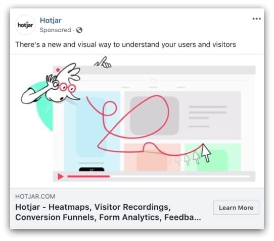
Hotjar is a platform that offers advanced web analytics tools. It provides tools like heat maps, visitor recordings, and conversion funnels, to name a few. With so many technical features to offer, you’d think that they’d opt for a video, slideshow, carousel, or even an Instant Experience ad to showcase them. In the ad shown above, they decided to keep things simple and stick with a good ol’ image. To make it stand out, they used a simple illustration of a webmaster/digital marketer examining a website with Hotjar. The lesson here is that no matter how complicated your product is, you can always find a simple and highly effective way to promote it.
To summarize, here’s what we like the most about this ad:
- Illustration– a simple, yet effective way of explaining what Hotjar is.
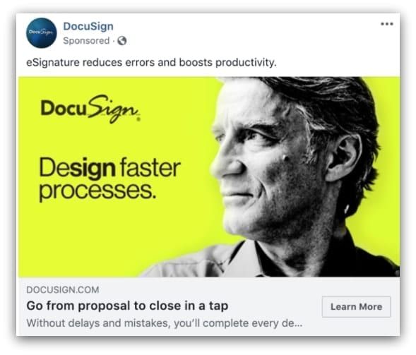
DocuSign is a cloud-based e-signature service that facilitates online agreements, contracts, and sales. The two selling points of the service are that it expedites important agreements and reduces the chances of errors. Those are the exact things that they’ve tried to sell through this image ad. The black and white side-pose headshot on a vibrant green background gives the image a retro feel. In the copy “Design faster processes,” they’ve written the letters that spell “sign” in bold – a subtle way to promote their e-signature services without even using the word “sign.” The lesson here is that you can also use simple font-formatting to deliver your message.
To summarize, here’s what we like the most about this ad:
- Typography– creative font format that promotes their e-signature services.
- Design– the perfect blend of contemporary and retro styles, making the ad highly attractive.
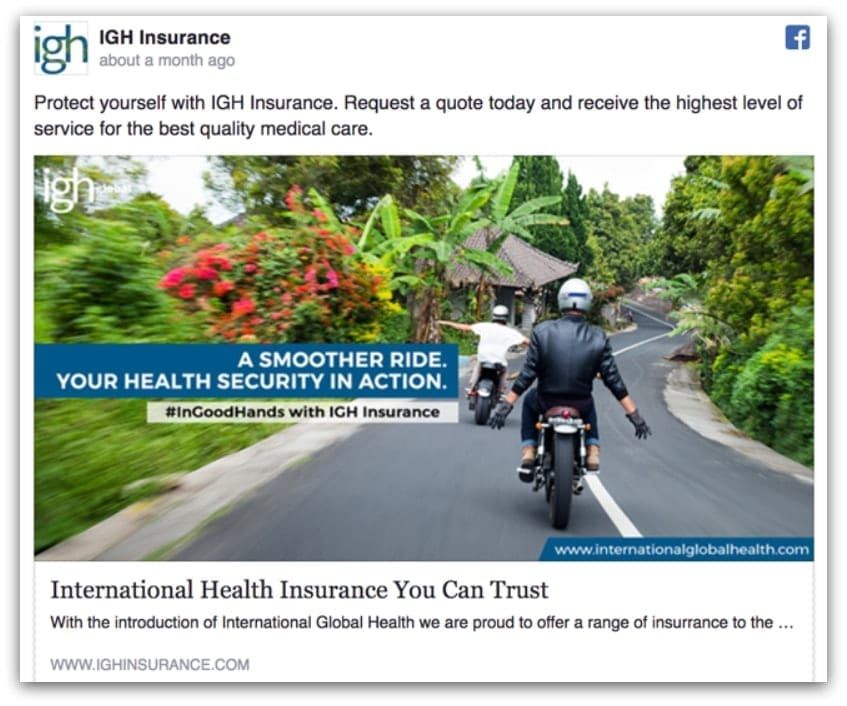
If there’s one thing that insurance companies try to sell, it’s the idea that you should live your life to the fullest. That’s the straightforward concept behind this Facebook ad for IGH Insurance. The “look ma – no hands!” ad features a colorful and captivating image of two bikers, riding their motorcycles without using their hands, which represents two things:
- Worry-free life
- A smooth health insurance process
The copy has been highlighted with rectangular shapes, making the ad clean and crisp.
To summarize, here’s what we like the most about this ad:
- Image– high-resolution picture that does a great job of subtly delivering the message.
- Use of graphics– clever highlight of the copy.
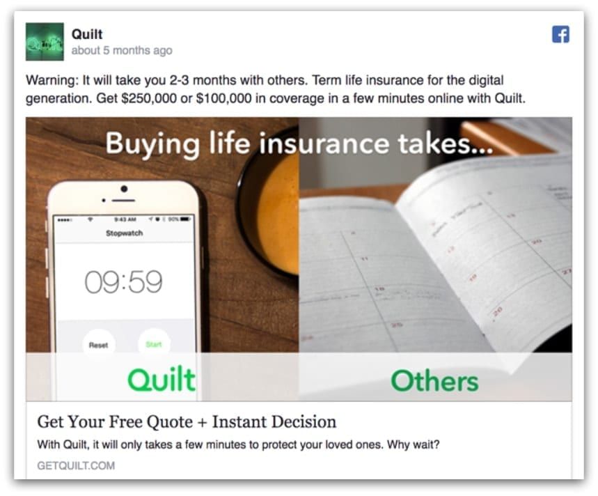
Quilt initially started out as a service that provided insurance fast. This ad, which shows a smartphone with the stopwatch open in one panel, and a calendar in the other, is a brilliant execution of the 'fast' benefit. In the right panel, the stopwatch app represents that it only takes 10 minutes to get insurance coverage with Quilt, whereas with other services, it could take up to months. This ad is simple, clean, and effective. All they’ve used are two stock photos and some text.
To summarize, here’s what we like the most about this ad:
- Execution– they’ve delivered the idea of “instant insurance coverage” quite well.
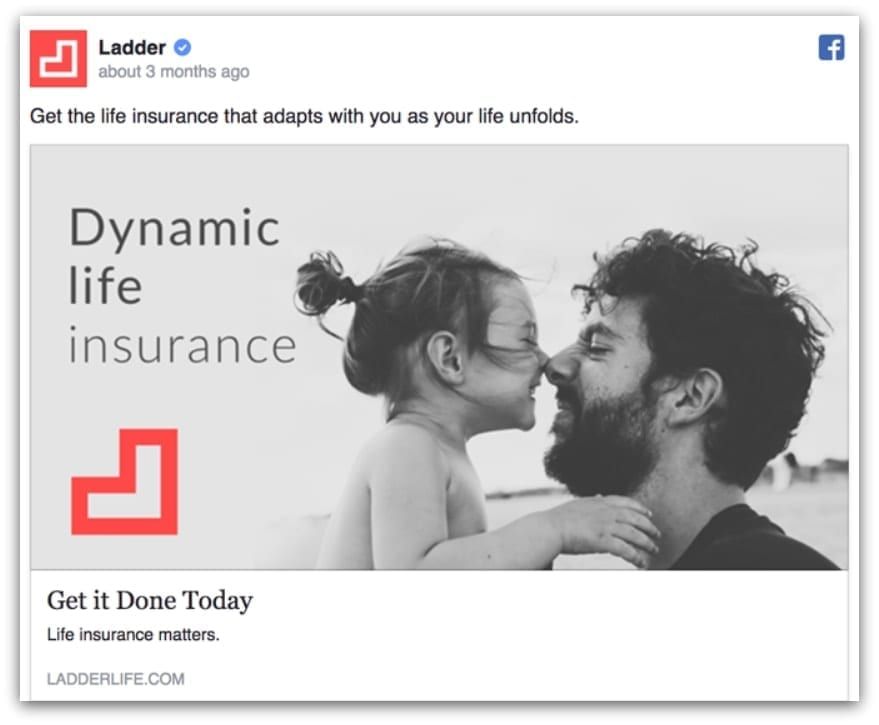
Ladder is an insurance company that specializes in providing dynamic insurance i.e. coverage that keeps changing from time to time, depending on your circumstances. In this powerful image ad, they’ve kept the concept easy to understand - caring for your loved ones. Who knew that a black and white stock image of a father and her daughter, together with some text and a colored logo would look great?
To summarize, here’s what we like the most about this ad:
- Image– the black and white stock photo goes remarkably well with the logo and copy.
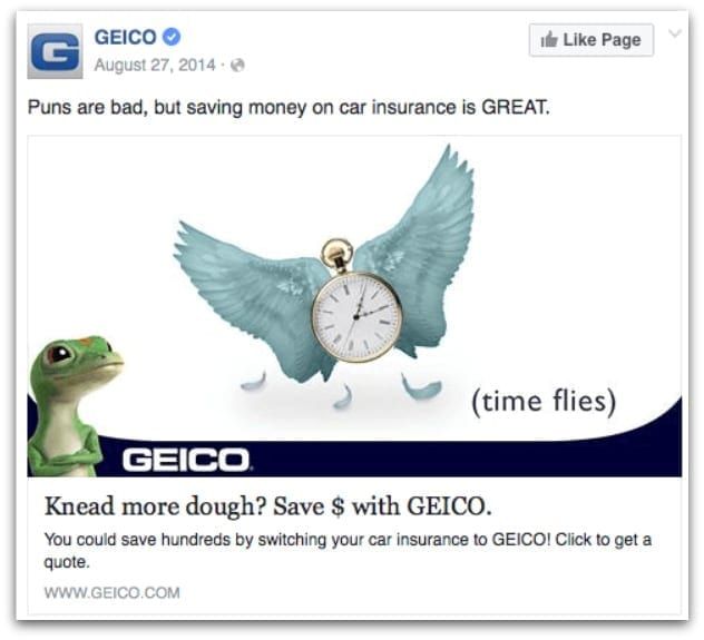
GEICO is an insurance company that specializes in auto insurance. Apparently, they also specialize in puns, which is obvious from this ad. The comical image of a clock with wings (which is completely unrelated to car insurance) is a take on “time flies.” Anyone scrolling down their timeline would definitely stop to appreciate this pun, only to realize that it was posted by an insurance company. The top-text, “Puns are bad, but saving money on car insurance is GREAT” clears things up. If that’s not enough, the headline, “Knead more dough? Save $ with GEICO” is another pun that delivers the message. The take-home message – it’s okay to use humor once in a while to market your products.
To summarize, here’s what we like the most about this ad:
- Humor & curiosity– creative visualization of well-known puns.
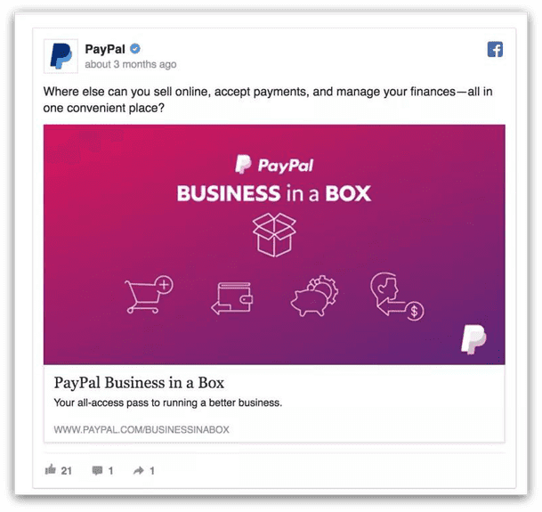
PayPal is a well-known payment merchant. This particular ad is for "Business in a Box" – a single platform by PayPal for businesses to launch their e-commerce websites, manage payments, and deal with marketing. The dark background is perfect for capturing attention, whereas the copy and the icon deliver the message perfectly.
To summarize, here’s what we like the most about this ad:
- Background– dark, eye-catching color.
- Icons & copy– beautifully explain the concept.
Ending note
And that concludes our list of 8 best Facebook ad examples. We hope that you got the inspiration you needed to make your own engaging and appealing ads. Remember—you don’t need to spend thousands of $$$ to create the perfect ad. All you need is some inspiration, a little coffee to spur creative magic, and a clearly-defined goal. If you’re still struggling to design an effective ad,