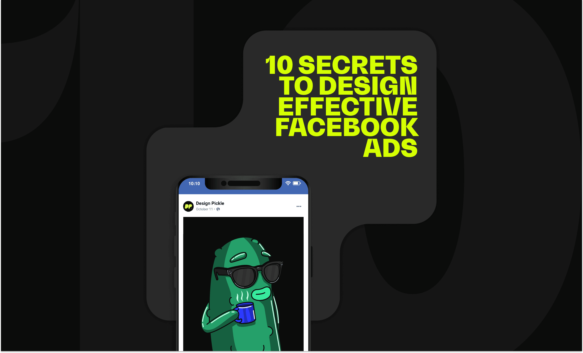
10 secrets to designing effective Facebook ads

According to a 2018 study, marketers consider Facebook to be the most important social media platform. And no wonder: Facebook has 1.47 billion daily active users. Having a Facebook page helps you increase website traffic, generate leads, target specific users, conduct market research with page Insights, and communicate with customers.
Say you’re in a secret Facebook group, planning a surprise birthday party for your best friend. Next moment, you’re at a local business page, inquiring about the funny personalized t-shirt you want to gift her. You move on to ordering personalized party invitations from a nearby print shop’s Facebook page. The following week, if all goes well, you recommend these shops to your friends. These local businesses have used Facebook to effectively market merchandise. You’ve hardly even left the app. So, yes: Everyone and their grandma is on on Facebook. But even these millions of users haven’t got all day to give you.
To get clicks and generate leads, you need to stand out from your competitors. To do that, you need a visual edge: great Facebook ad design.
Make graphic design part of your business strategy. But don't worry — It isn’t all that hard to successfully advertise online. Here are 10 not-so-secret secrets to designing beautiful and effective Facebook ads.
Keep it straightforward.
Most people never read past your headline; that’s just the way things roll (or should we say, scroll). Make sure that your few seconds with the reader is as informative and concise as possible.
Hype it up with a sense of urgency.
“Limited offer! 3 days left.” People keep deadlines in mind. Check out AirAsia’s ad below. By giving their audience a due date, they’ll get clicks and increase website traffic sooner rather than later.
Make people feel safe.
It’s said that fear is the emotion that most influences consumer activity. To help push sales with your Facebook ad, use magic phrases like “risk-free” and “money back guarantee.” Check out how WINC does this in their ad below.
Appeal to the heart.
Related interests and causes will bring your business to more specific, and therefore more authentic, audiences. Does your target audience also like sports? Movies? Pets? How about making your ads location-specific?
Appeal to the brain.
Numbers, numbers, numbers. Include social proof, or statistics. Remember the iconic McDonald’s slogan? “Billions and billions served!” Now, we mere mortals don’t have to go into the billions, but the point is that numbers are deeply reassuring.
Don’t forget your call to action.
“Try Now! Book Now! Shop Now!” A bit forceful, yes, but you’re not being bossy: you’re saving your interested customer from a moment of indecision. Call the shots so that they know the next thing to click.
Add emojis to the ad text.
This is social media, not a corporate email. A personalized, conversational feel is a good thing. Don’t go overboard, though.
Use illustrations
When done right, an illustrated ad is incredibly eye-catching. Icons and mascots (like the MailChimp example above) are marvelous communicators. Facebook requires that overlaid text does not exceed 20% of the image area: you have the headline and the caption for that. Let your images speak for themselves as much as possible.
Pro Tip: Don’t be afraid to use bright, engaging colors. Blue is trustworthy; green is calm; red is happy and powerful; orange is dynamic but ranks low as a favorite color. The key is experimentation: try out a few different color approaches and see what works best for your brand!
Try stock photos
A stock photo subscription is a great way to access beautiful, professional images without having to go through the trouble of shooting your own. Selecting high quality, relevant images helps bring your brand into the spotlight. With Design Pickle, you can add a
Pro Tip: Images of people always work best. The sight of another human face triggers a stronger response in potential customers.
Use your own high quality images
If time and budget allow, nothing beats having high-quality images of your very own products and services. Good images keep your brand relatable, trustworthy, and most of all, click-worthy.
Pro Tip: Show images of people associated with your product. While using a stock photo is already a winning move, having an actual image of a person with your product ups conversion by 35%. Even Facebook recommends this!
According to a study of more than 100,000 Facebook ads, images account for 75-90% of ad performance. Now it’s your turn to stay relevant and launch your own online campaign. Perhaps you’re a small or a new business, but that doesn’t mean you’re entirely on your own.
You don’t need to break the bank, either. Design Pickle is the leading creative subscription service, offering reliable design support from top-tier talent. What are you waiting for? Your time is valuable. Let us help.
