Quality Creative Delivery: How Picky Pickles Source & Keep Top Design Talent

is arguably one of the biggest challenges and vetting hurdles brands experience when they pick a design solution. Whether you’re hiring in-house designers, assessing freelancers, selecting a design agency, or narrowing down which creative as a service (CaaS) design partner is best, assessing quality creative is insanely important, and equally difficult. As we wrestled with this fundamental challenge, we listened to thousands of creatives and marketers or teams who rely on creatives and marketers to share their struggles. We expected there to be commonalities– and sure enough, four basic concepts emerged that we all agree are
universallya challenge. We’ve uniquely solved this challenge with care and intentionality (so you don’t have to). Ultimately, it made us ridiculously picky pickles. We have to be, so you can trust us to deliver for you and your brand. Today, less than 1% of applicants make it to our production floor. We also invest in third-party applications to provide unbiased hiring and the best creatives. Ivy League schools aren’t even this selective. But it’s not just about our selective application process. Read on to learn how we do it – and how we’ve scaled it for future success.
3 Reasons Assessing “Quality” Creative is a Challenge
- Design is art, and “good” art is subjective and difficult to standardize and scale.
- Clear direction/a great creative brief (or lack thereof) makes or breaks the results.
- Human designers deserve individualized feedback that fosters growth, which is time-consuming when done right.
We look at each of these pain points as an opportunity to seize an evolved creative process that has already solved these (unfortunately) oh-so-common challenges.
The Art of Using Objective Criteria to Evaluate Creative Assets
Whether you’re super close to the creative process day-to-day on your team and giving feedback like “close that kerning” and “color correct this bit here” or you’re a bit more removed and haven’t opened Adobe in a while (or ever), being able to give objective feedback is critical. Objective feedback is
actionable. This type of feedback removes the ambiguity and creates a tangible next step toward the requestor’s vision. One of the most rigorous parts of our quality assessments has seen many evolutions as we’ve grown and scaled. Before the artist is even on the production floor and receiving requests from clients, candidates get a chance to shine and showcase their skills and familiarity with common design software. The criteria that are evaluated culminate in an overall Creativity Test score which is composed of three key factors: aesthetic, technical ability/execution, understanding instructions, and critical thinking. We set a minimum passing score on our rubric of 70, and we require multiple evaluators to score an assignment to further prevent biased decision-making. Quality is objectively evaluated across a variety of concrete areas. We evaluate each of these areas with a numerical score by asking ourselves and other peer evaluators standard questions, helping us ensure consistency and fairness. For Design Technicality, we consider the following categories:
Composition and Proportion
All elements within a composition relate well to each other and there is proper use of white and negative space/area.
- Does the image feel too busy?
- Does the composition feel crunched/crowded?
- Do the proportions of each element make sense contextually?
Color Palettes
Logical structure of color, harmony, context and contrast.
- Do the colors used work well together?
- Do the colors help achieve the goal of the piece according to color psychology and other color theories?
- Do the colors offer enough contrast and saturation to read them as intended?
Alignment
Elements and text are all orderly, structured in a visually pleasing format (or as intended), with close attention to detail.
- If the design requires perfect alignment, do all rules/grids measure correctly?
- If alignment is meant to be playful and carefree, does the design deliver that?
- Are lines of copy spaced appropriately with balanced kerning, tracking and leading?
Visual and Textual Hierarchy
Proper use of contrast, color, shape variety and text arrangement to emphasize the most important sections of the design.
- Does the eye see the focal point first?
- Does the design guide the eye around the design intentionally with purpose?
Font Choice & Styling
Choices of fonts and styles are harmonious with the design and brand, in context with the design, as well as legible and cohesive.
- Are style and typography treatments applied to ensure there is a clear hierarchy (if applicable) for all copy?
These questions help guide a trained evaluator to make objective observations and provide clear feedback to achieve specific criteria. While not perfect, these criteria are arguably leagues more objective than directions or feedback like “make it pop.” 😁 There are additional criteria at this step that include asking questions like, “did the design meet the high standards of Design Pickle by being crafted with intentionality, effort and consistency?”, “Can the designer maintain quality across various styles while adhering to design fundamentals?”, “Can the designer handle different types of projects (social media designs, editorial designs, web designs, etc)?” Or, “Are the designs in line with current design trends or do they feel out of date (unless stylized that way intentionally by request)?” There is no “final state” for this quality evaluation because continual calibration and iteration prevents the model from going stale and bad designs slipping through the cracks!. Finally, we make sure that our creatives are proficient with the industry’s prevalent software to deliver designs that meet the highest quality standards. We’d be remiss if we didn’t mention that of course we believe design is art, which means a client might find a design to be the absolute bees knees and that same design could simultaneously score a 0 on our evaluation. All art has merit and has value; we’ve simply captured one possible way to ensure consistency that works at scale. In addition to this, we also have a two-week holistic program focused on Equipping and Assessing our Creatives We focus on teaching the base process by following the standardized Overall Support Process Flow for all services, we review quality and offer support and feedback on how to improve the creatives' performance. We let Creatives experience what they learned simulating the production floor using the most common types of request for each specific service with an incremental workload that pushes their pacing to the standards expected in the production floor.
Great Input Creates Great Output
We’ve been around the proverbial block a few thousand times (as you read this, someone is likely close to requesting our 2 millionth request…). One of the most consistent predictors of a great final draft is a great creative brief. The more specific and clear the request details are, the better chance the creative has of interpreting the vision and bringing it to life. There are 5 basic steps to give a great request for any design type. Let’s start there.
Step 1:Describe your instructions in detail. See our next section for deets on the details!
Step 2:Add copy if your design needs it.
Step 3:Upload or select supporting documents and images. Pro tip: Annotate those supporting files so your designer knows exactly what you like and don’t like about the reference materials and attached image assets. Our designers tell us what they love to see in an “ideal” creative brief (or design request). Here are a few of their pro tips for communicating your vision:
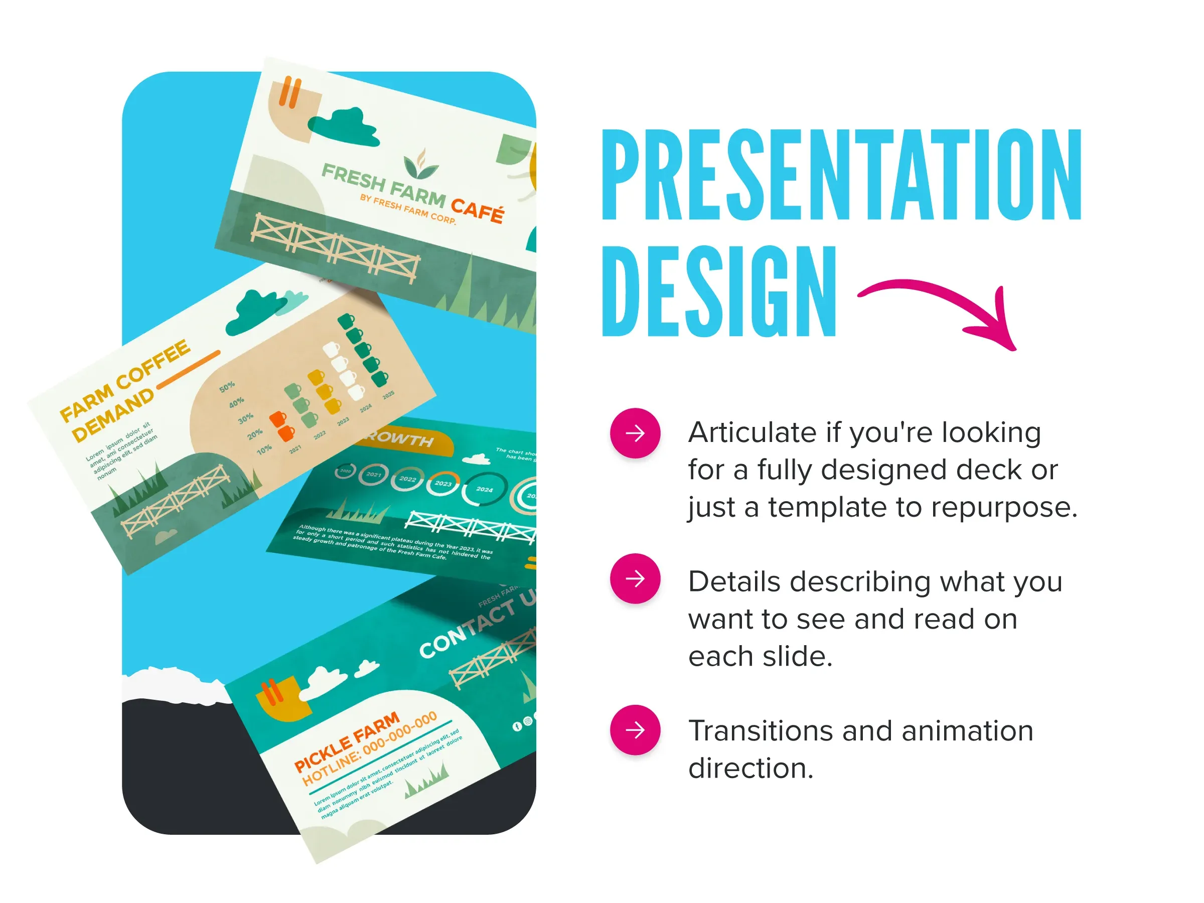
Tips for requesting custom presentation designs:- Articulate if you’re looking for a fully designed deck or just a template to repurpose.
- Include details describing what you want to see and read on each slide.
- Explain how you want to see transitions and animations happen.

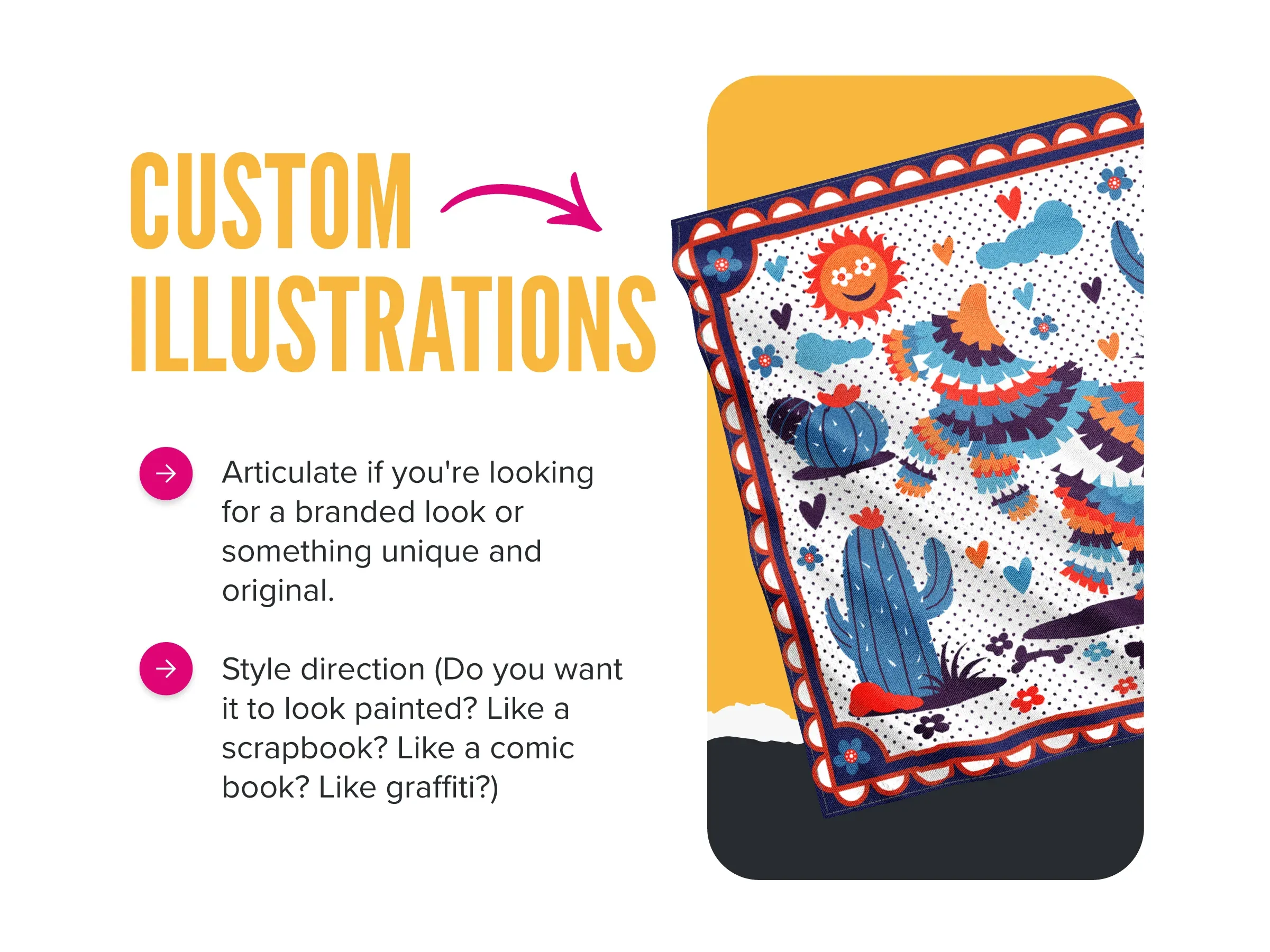
- Articulate if you’re looking for a branded look or something unique and original
- Explain the style direction you want to achieve. Do you want it to look painted? Like a scrapbook? Like a comic or graffiti? Give details and even provide sample designs.

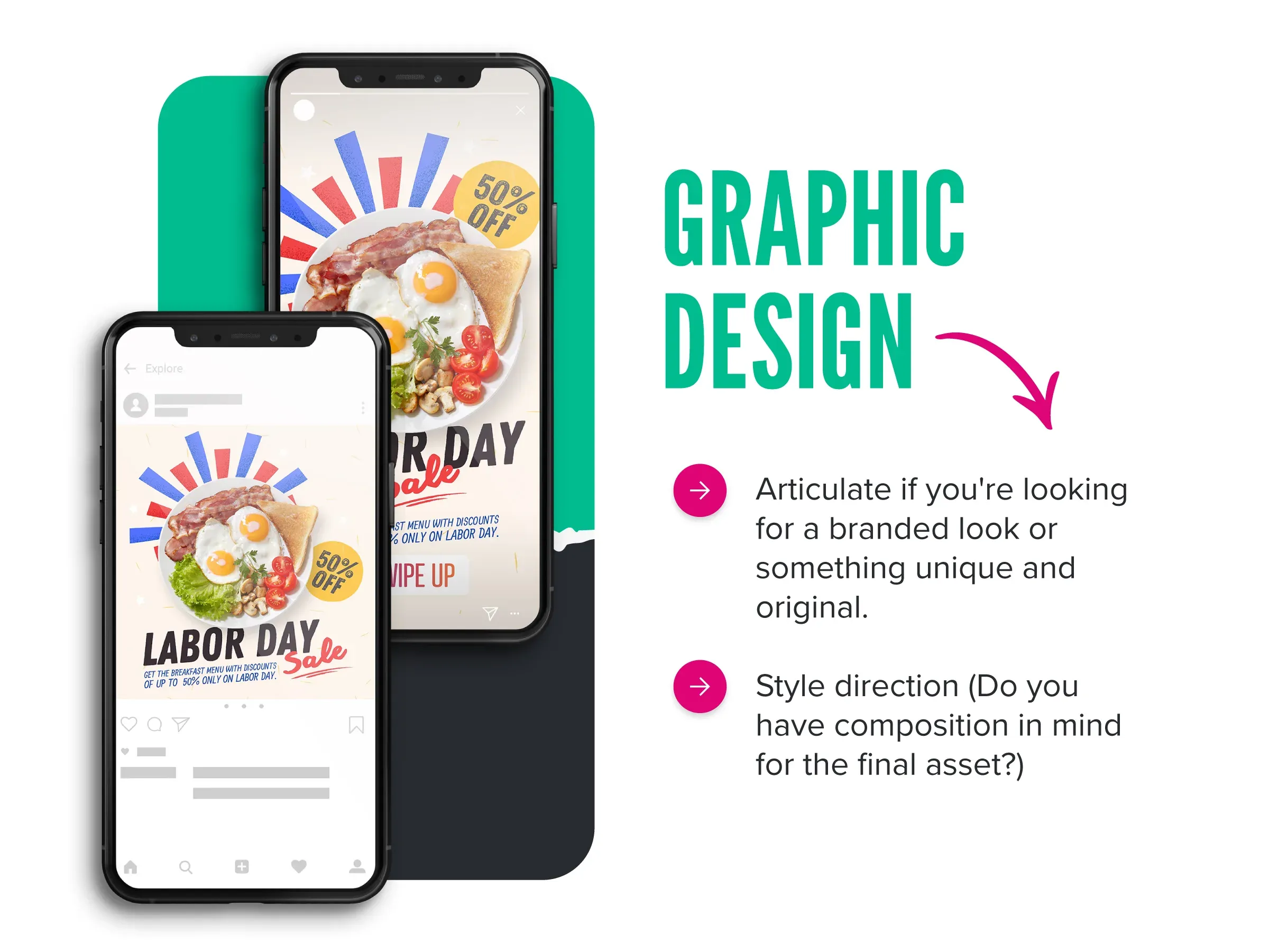
- Make it clear if you’re looking for a branded look that needs to fit within a cohesive aesthetic, or something unique and original.
- Explain your vision for the composition and style. What do you want to achieve with this design?

- Always include inspiration – from art style to animation speed and style, to sound pacing.
- Ensure your artist knows where your final asset is going live so they can design with context in mind.
- Select the proper dimensions initially to save re-sizing hassles and delays down the road.
We’re committed to making our clients excellent requestors because we know the quality of their results is consistently high quality when their briefs are high quality, too. Plus, as requests become more frequent, designers learn your requesting style and your taste, creating more efficiency as you work together longer. Learning a little designer speak also goes a long way. While it’s never required to know every little acronym (is it CMYK or CYMK?), when you use the lingo your designer is used to, chances are better that your directions will be received accurately. While we won’t ever know what your teen is saying 😬, we can help you pick up more creative terms!
Human Designers Should Get Human Feedback
Designers are artists, proudly some of the most empathetic and sensitive people among us. Creating anything is personal, even when it is business, and that can make receiving feedback difficult, even when it’s intended to produce great results, polished skills, and happy clients. Part of how we evaluate our potential pickles is not just on their ability to technically execute good design, but also on their communication skills, their ability to pay attention to detail, whether they push themselves or play it safe, their ability to receive and absorb feedback as well as their aptitude for growth. Designers who are hungry to learn tend to believe that feedback is an opportunity for improvement. This kind of culture fit is super important to us at Design Pickle and ensures that our clients never worry about damaging our designer’s egos when they ask for yet another change on that postcard request that’s on V10. (Did you know? Easily bruised designer egos are a pain point not surprisingly on our client’s list of top 10 reasons they recommend ditching the in-house design teams). Equally as important as designers being receptive and open to constructive criticism and feedback/revision requests, if not more important, is the feedback itself and the way that team leads and clients communicate the feedback. We simply request respect, clarity, directness, and guidance that is as actionable as possible. Leaving room for interpretation and being passive-aggressive are two ways that are proven to perpetuate the feedback loop; that’s why we work so hard to prevent ambiguity and negativity. The way that we evaluate creativity objectively at Design Pickle happens every day, across so many functions. It’s an integral part of how we operate in order for you to rest assured we’ll deliver. From the designer application process to the regular review of client assets, from ongoing talent evaluation and regular creative audits, these are just a few of the processes that make our pickiest pickles proud. PS: Did we mention that Quality is a top theme among our 5-star reviews from real clients across G2, Trust Pilot, Google My Business, and more? Don’t take our word for it. See what people are saying:

