
You already know why content marketing is important to your business. But how do you convince your audience to actually consume the content you create?
Three words: social media marketing. According to Statista, over 3.6 billion people use social networking platforms worldwide. If you take our current population into consideration — 7.9 billion people — there’s a pretty good chance your next customer is a daily user of one social networking platform. Or two. Or three.
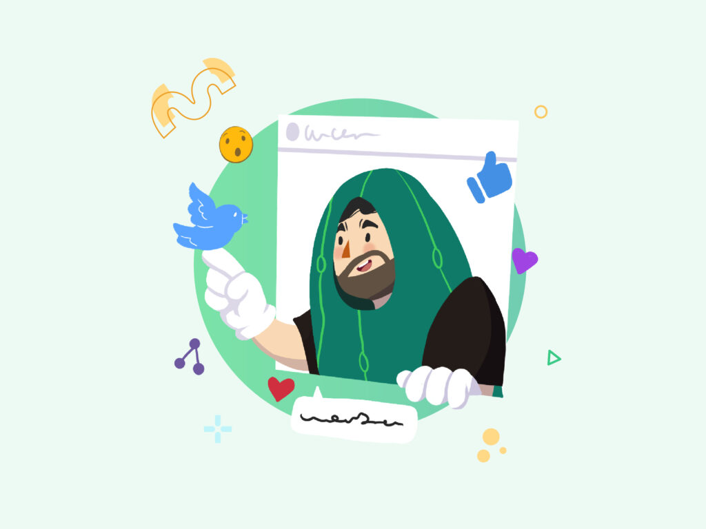
Of course, you can’t expect to open an Instagram account and gain an Ariana Grande-like following with less than production-quality visuals. Those 3.6 billion potential customers are online, but are they on your page? That’s why when it comes to designing for your social media accounts, design strategy is important.
Design Pickle’s very own graphic designers create social media graphics day in and day out. We asked them to weigh in about what makes a beautiful, professionally crafted social media design.
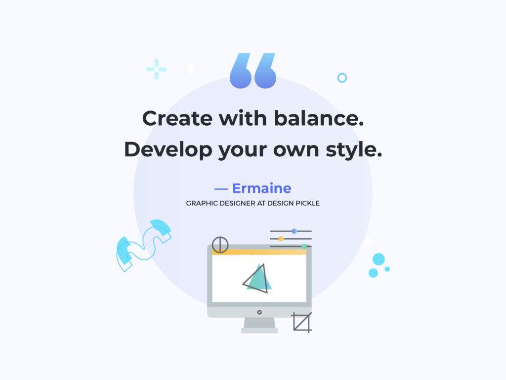
1. Be Goal-Oriented
“Listen to your audience and everything will follow.” — Nicole
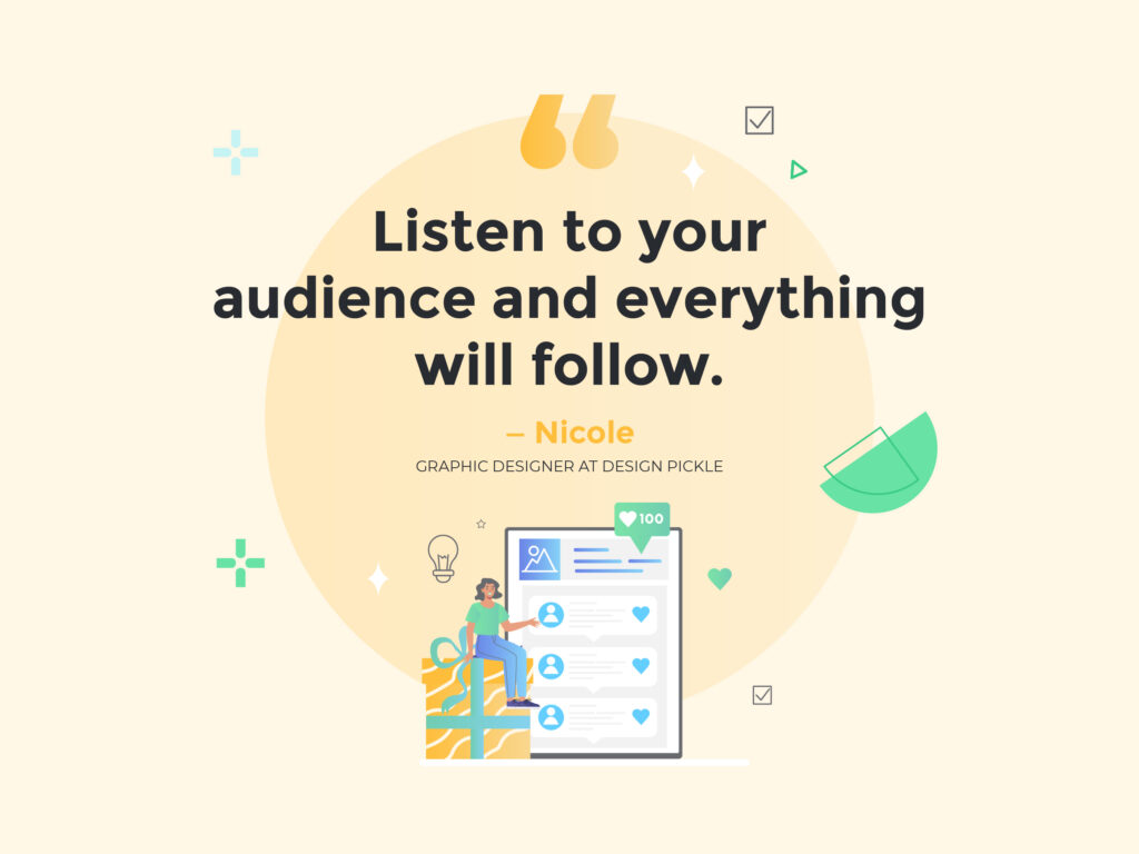
Your content isn’t for everyone. But there’s one special group of people you should always aim to impress and engage: your target audience. Before creating and publishing a design, ask yourself:
- What is the message? What am I trying to communicate to my audience?
- What response or emotion am I trying to elicit from my audience?
- Based on what I know about my target audience, what aspects of this post do I think will resonate with them? If I were in their shoes, would I be moved to respond to the Call To Action?
- On which social media platform and device will I reach my target audience?
The more goal-specific you are, the better equipped you’ll be to create the perfect concept and design for the intended post. With the right clarity of mission behind it, your finished design is more likely to use elements that support this goal.
2. Always Use the Right Format
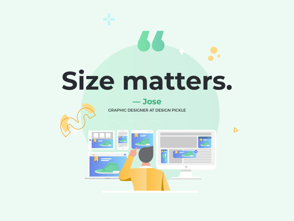
Your post’s format will depend on your intended social network (which may recommend various sizes for different types of posts). These days, social media platforms tailor their image requirements to user devices. Don’t let format be an afterthought. In the conceptualization stage of your creative process, consider which devices your audience may be using in addition to the social platform.
To optimize your workflow, aim for a design that’s easy to optimize for different formats. If you intend to post to multiple channels, you may have to resize — and reformat — the image depending on the post type. You can think of it as creating a single postcard design to put in different envelopes. It may seem tedious, but it’s a good habit to optimize for each and every post type if you want to send the right message.
Designer tip! Social media networks can sometimes alter their ideal size and desired graphics they support, so be sure to evolve your design as these changes take effect.
The best way to find the latest recommended post sizes is to go straight to the source. For example, Facebook offers an all-encompassing Facebook Ads Guide, LinkedIn has a handy cheat sheet, and Twitter provides a user-friendly list of advertiser creative specifications. Choose your fighter!
Also, the internet is full of useful compilations — Sprout Social’s always up-to-date guide is a quick glance into the image requirements of the top social networks.
3. Keep Text to a Minimum
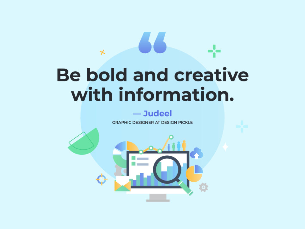
Seasoned social media marketers know about Facebook’s rule that text can’t occupy more than 20% of a paid ad image. Guess what — they removed that restriction in 2020. That said, the fact remains that it’s best practice to keep text in images at a minimum. It’s social media! You can use captions if you have something to say. When possible, let the picture paint your thousand words. 😉
There are exceptions to this “rule,” though. Some posts are meant to be flat-out proclamations: Black Friday Sale! Merry Christmas! 50% Off! In those cases, make the typography count.
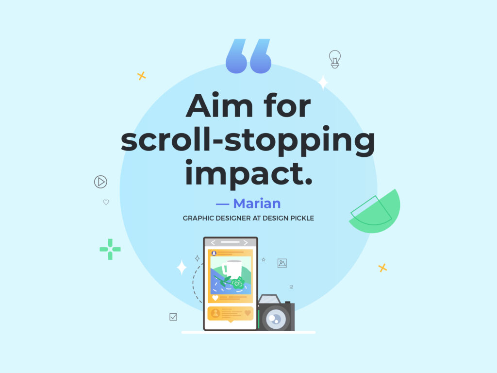
4. High-Contrast Graphics Stand Out
Low-contrast graphics can make it hard to distinguish between design elements. The right balance of light vs. dark, big vs. small, and sharp vs. soft elements can bring any social media post to life.
High-contrast designs are highly recommended, giving you an opportunity to stop the scroll that a subdued look just won’t achieve. However, remember to balance this piece of advice with our next tip — staying on brand. Even if your brand identity is subtle and restrained, there are still ways to dial up the contrast for your social media posts, resulting in properly balanced, easy-to-digest designs.
5. Stay On Brand
The biggest social media platforms are free for anyone to use. Visual unity sets a brand apart from its audience by exuding authority and professionalism. To create a consistent social media presence, remember that a brand guide is your best friend.
A brand guide is a collection of pre-selected fonts, color schemes, design elements, logo variations, and sample graphics that accurately represent a brand. (Check out our free handbook about how to create a complete brand guide.)
Have you done any A/B testing? It’s as simple as looking back at your social media metrics to find out which posts perform best. Next to your brand guide, this can give you the best clues as to how to design your next post. You deploy two different versions of a single post, choosing which feature to vary — the color, the font choice, the imagery — and analyze which one performs better. You may be surprised at what makes your audience stop and click!
6. Less is More
Social media is a crowded world and posts are usually viewed on small devices. There’s no need to crowd your canvas with elements. Keep it simple!
Here are a few tips for simpler, more striking graphics:
- Use large, eye-catching elements.
- Limit typography to 2 font choices. Three is okay, but pushing it!
- Stick to a simple color palette.
- Don’t be afraid of negative space.
But there’s so much you want to communicate! Wouldn’t it be better to pack as much information as possible into the post? Well, we understand your fears. But when it comes to designing for social media, it’s often better to stick to one simple message at a time.
There are two reasons for this: short attention spans and feed aesthetic. Simple messages are workable because it’s ideal to post regularly anyway, while simple designs can give you a better overall look (especially for Instagram), which evokes professionalism.
7. Be Trendy and Timely
A good-looking social media presence strikes a balance between your homegrown aesthetic and the current design trends. Publish content that audiences love seeing — but try not to break your own branding rules along the way.
Agile posting is also a good way to make audiences do a double-take — ride the wave of fun current events or get inspired by the week’s most popular meme. Craft a crystal-clear CTA so as not to waste those precious few seconds with your viewers. And again, design with the right fusion of on-brand and trendy.
8. Utilize Visual Hierarchy
Imagine you’re designing a billboard ad on a highway where the motorists are allowed to stop. But there are so many distractions surrounding the billboard and brand recall is painfully low. Social media is the same: people scroll past hundreds of posts every day.
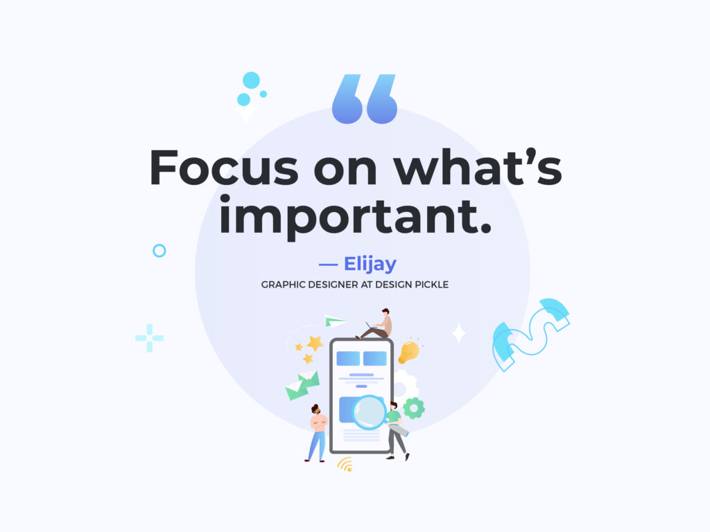
Even if you boost your posts for more visibility, you still run the risk of becoming just another sponsored post. With only a few precious milliseconds to engage your target audience, your post graphics should focus on what’s important using visual hierarchy.
Visual hierarchy is the order in which a viewer sees the elements of a design. It’s intuitive and totally under the designer’s control — it’s simply a matter of making certain elements more noticeable.
There are many ways to add emphasis to an element: Through size, weight, and color. If your image contains text, emphasize your message by focusing on the most significant phrases. If your image is attractive at first glance, there’s a better chance that viewers will stay to take in each and every element.
9. Stalk Stay Inspired
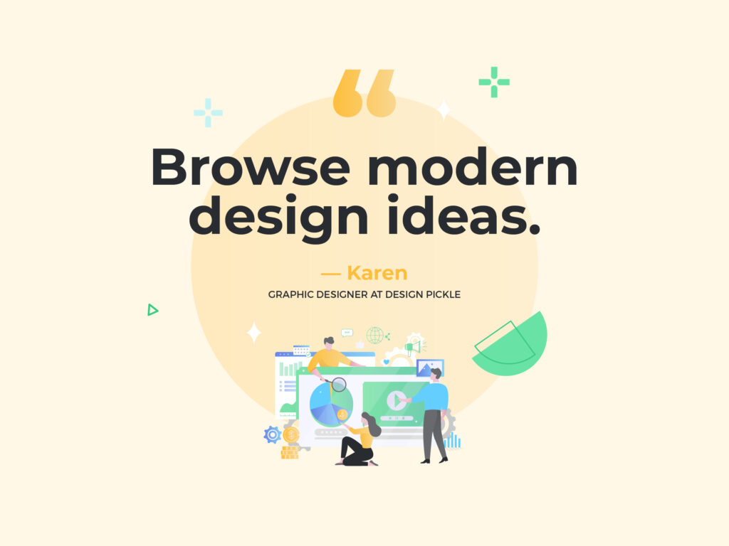
Browsing through social media doesn’t have to be an idle activity — turn some of those scrolling hours into research! Look for real-life use of current design trends and analyze the aesthetics of top businesses and influencers.
Don’t be afraid to venture off-platform to see what kind of design is prevalent in other apps. Which platforms use more photos? Which use more illustrations? Which have more text on the images? When it comes to design, you sometimes need to learn how to conform to trends — before finding out how to break a few rules to stand out in the crowd.
If you’re looking for a quick fix of social media graphic design inspiration, check out Design Pickle’s social media design samples.
Bonus Tip: Use Inclusive Stock Images
Stock assets cover a wide range of categories: there are stock photos, videos, graphics, illustrations, post templates, mockups, audio, and more. They’re royalty-free, which means anyone can use them in creative work.
Using stock images won’t take away from a brand’s uniqueness: with thoughtful use, they can imbue your social media profiles with authenticity, authority, and increased visual appeal.
Are you ready to level up your social media marketing? Start making social media work for you and tap into Design Pickle’s unlimited graphic design subscription. With our growing collection of socially inclusive graphics, you can connect with your audiences in a way that matters. Get started today!