Sometimes there seems to be a magical black hole between your computer and the printer, in which everything goes wrong. Your leaflet comes out wonky; the text is running off the edge of your brochure; your billboard is totally unreadable. At one time or another, many of us have exclaimed: “It looked all right on the screen!”
No, you’re not cursed. There are a number of major mistakes that can be made during the design process, and here are four of the most common.
4 Common Print Design Mistakes:
1. No bleeds and margins

Bleed refers to the part of your design that extends outside the print area. Margins are the inner edges of your print.
While minor errors in cutting can rarely be avoided, without bleed a cutting error can result in exposed white space, which can hurt the look of an otherwise acceptable print. 3mm of bleed on all sides is usually good enough to avoid this.
Without set margins, you may end up putting important design elements (like text) way too close to a document’s edge. Parts can be cut out. Appropriate margin sizes can vary.
2. Low resolution

Are your images or graphics coming out blurry? Check out the resolution or the DPI. DPI means dots per inch, and a higher number means a denser, more faithful, and sharper print.
For print materials, 300dpi is the usual standard. For larger scale prints, you can go as low as 150dpi. And note that the dots per inch count alone doesn’t matter. The resolution goes hand in hand with the correct size.
3. Wrong color profile
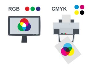
You’re excited to receive your vibrant printout, but when it arrives, the colors are disappointingly flat. Really different from what the design looked like on screen. Chances are, your design was created and viewed in RGB, which is the wrong color profile. Designs meant for print should be created in CMYK.
What’s the difference?
Screens use RGB (red, green, and blue) light to render images. A vast range of colors is possible, including colors that can’t be printed because they have the added factor of screen luminance.
Meanwhile, printers use CMYK (cyan, magenta, yellow, and black) inks to render images. When you build your design in CMYK, you’re already previewing colors that can be printed. This way, you have more control over the printed design.
4. Designed for poor readability

Many print mistakes are inherent to the layout itself. Here are a few design mistakes that will render your printout unreadable or unappealing:
- Tiny text. For labels and flyers, 4-6pt is the minimum.
- Long lines of text. Whether your audience reads from left to right or right to left (or even vertically), don’t make their eyes travel in one direction for too long. Limit the number of characters per line.
- Too many fonts. Experimenting with fonts can be fun, but you really have to limit your font use to three at most. More than that, it gets confusing and, frankly, a tiny bit ugly.
- Bad kerning and leading. Kerning is the space between text characters, and leading is the space between lines of copy. When kerning and leading are too narrow or wide, or worse, erratic, your text becomes hard to understand.
- Lack of negative space. Also called white space. It may be tempting to fill up every square inch of your layout with elements. But actually, blank spaces serve a purpose of their own: to highlight more important elements. It’s hard to get a message across when too much is going on.
- Lack of alignment. Absolute symmetry is not required, but at least set a few rules to follow. Misaligned elements are jarring and unprofessional. If you can’t align your headers with your body text, what can your readers trust you with?
- Lack of contrast. Without contrast, you might as well have no content. For example, it’s hard to read red text on a green background or gray text on a beige background.
So, which of these common print design mistakes have you experienced making? Let us know which one you are most excited about fixing. Or check out our handy Graphic Design Cost Calculator to find out how much you can save on stunning print graphics today.