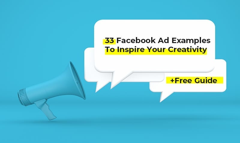
Let’s face it – creating the perfect Facebook ad takes a lot of work. If you look at some of the best Facebook ad examples, you’ll realize that to stand out – you have to really test your imagination.
With so many brands competing to grab the attention of millions of Facebook users (to give you a perspective, Facebook is earning nearly $67.37 billion in net ad revenues) it makes sense why you need to emphasize on making your Facebook ads captivating and engaging.
However, it’s not always easy to come up with amazing ideas on your own.
But inspiration doesn’t have to exclusively come from within.
At times, you’ve got to look at what other people are doing to get those creative juices flowing.
If you’re currently suffering from a creative block, then keep reading – in this article, we’re going to show you 33 Facebook ad examples to give you the graphic inspiration you need, and a free ad template to kick start the process.
The Main Categories of Facebook Ad Examples
Before we move on to the actual examples, let’s review the different categories of Facebook ads and what makes them special.
If you’ve already decided on the format of your ad(s), you can jump straight to the examples.
It might be possible that you’re limiting yourself to one specific category and not exploring other, more creative alternatives.
As of now, Facebook lets you create ads in the following formats:
Video ads
As far as social media ads are concerned, video is considered highly effective.
In fact, according to one source, the world collectively watches 4.6 billion video ads online every year.
That’s insane!
If you’re thinking of creating a video ad, make sure that you follow these aspect ratios recommended by Facebook for different placements:
- Feed – vertical 4:5
- Stories – vertical 9:16 (full screen)
- Carousel – square 1:1 (keep it consistent throughout the carousel)
- In-stream – horizontal 16:9 (full screen)
Here are some other requirements for Facebook video ads:
- Length – minimum 1 second and a maximum 240 minutes
- Size – maximum 4GB
- Text – not exceeding 125 characters.
- Thumbnail – must include no more than 20% text (use this tool to check)
Check out this tips if you’re looking for creating animated Facebook ads that can help with improving conversions.
Image ads

These are the most common forms of Facebook ads.
Image ads use the power of visually-appealing static posters to grab the attention of users. Do not make the mistake of underestimating the power of art, as it can make or break your ad.
In fact, that’s one of the top 5 reasons paid ads fail.
If you want a quick way to promote your business online, an image ad is your go-to option.
The best thing about image ads is that they’re easy to create. By using certain tools or a Design Pickle Designer, you can create a stunning ad, on-the-go.
However, there are certain limitations and recommendations by Facebook which, if followed, can set your image ad up to perform well.
Here are those recommendations:
- Format – Facebook only accepts JPG and PNG files for image ads. If you want to use animated GIFs, opt for the video option.
- On-image text – Facebook recommends on-image text to not exceed 20%, which you can check using the same tool mentioned earlier. The more on-image text you add, the less likely it is for your ad to reach its full audience. The point is to make the images seem less spammy.
- Aspect ratios – 1.91:1 to 4:5 for ads without links. If you want to include links, the recommended aspect ratio is 1.91:1 to 1:1.
Check out Facebook’s guide for image ads to learn about other technical requirements.
Collection ads

Video and image ads can only get you so far.
When it comes to actually purchasing something, users prefer a seamless experience that lets them browse through your products.
This is where collection ads come into the picture.
Think of these ads as a mini-catalog for your products. A typical collection ad has:
- A featured image or video.
- Four images of your product(s).
Whenever a user clicks on an ad, they’re taken to a page powered by Instant Experience (which loads in the blink of an eye, by the way) where they can view even more products and the details that matter – like pricing.
Collection ads let you create quick in-store experiences for your users who can browse through your offerings seamlessly. They’re highly recommended if you have a wide range of products to promote or simply cannot fit everything into a standard image ad.
You can also use collection ads to promote a single product, service, or experience with different images.
Here are some technical recommendations:
- Headline – limited to 25 characters (you could opt for a longer headline but Facebook may cut it)
- Text – limited to 90 characters (again, you could go for longer text)
Carousel ads

Similar to collection ads (as you can see in the Facebook ad example above), carousel ads allow you to add multiple images.
Here’s how they’re different:
- You can upload up to 10 different images and videos of your product(s) as “cards”, each with a separate link.
- There is no featured image or video.
- Any card, when clicked, takes users directly to a relevant landing page.
Like collection ads, carousel ads are great if you want to promote multiple products through a single ad.
You can add specific details about the products/services/offerings (like price, name, etc.) in their cards. This makes it easier for users to quickly browse through whatever you’re offering.
You can also use carousel ads to promote a single product or service, like an app, or, to tell a compelling story.
Like any other type of Facebook ad, carousel ads have some technical limitations and recommendations:
- Cards – anywhere between 2 and 10 cards are allowed.
- Images – only JPG and PNG formats are allowed. The size limit is 30MB.
- Videos – make sure that the size doesn’t exceed 4GB. Click here to see the list of supported video formats.
Slideshow ads

If you want to create a video-like ad, but don’t have the budget for it, a slideshow ad is the best option.
Slideshow ads are created by merging multiple images. They play seamlessly like video ads, with sound and text.
However, unlike videos, slideshow ads load quicker, regardless of the speed of internet connectivity. You also don’t have to worry about compatibility issues.
With a handful of images (and in only a matter of few minutes), you can create a captivating story for your brand without having to go through the hassles of shooting, compiling, or editing a video.
The technical specifications are the same as video ads.
Instant Experience

Instant experience isn’t a separate category of ads, per se, but rather a Facebook feature that allows you to enhance your ads.
Used mostly with collection ads (as discussed earlier), Instant Experience is the name given to visually-appealing, full-screen pages that instantly open up once an ad is clicked on.
Unlike standard ads, an ad with Instant Experience doesn’t take the users directly to landing pages. You can either choose from a collection of templates or create a custom instant and immersive experience for your ads.
You can use Instant Experience on every type of ad, ranging from videos to carousels.
To see the recommended specs, click here.
Subcategories of Facebook Ads
Let’s discuss the subcategories of Facebook ads.
These are classified according to the different goals an advertiser could achieve through their campaigns.
Let’s have a quick look at each:
Lead generation ads

Generating leads through Facebook ads is now easier than ever.
It’s hard to find the perfect marketing balance to get your target audience to fill forms, especially on mobile.
But with Facebook’s special lead generation ads, you can create a custom form which, when opened by users, automatically fills up most of the fields with their info.
You can publish your lead generation ad as a video, image, or a carousel. Whenever a user clicks on your ad, they’ll be taken to your form (which pops up like a post-click page powered by Instant Experience).
There are no specific recommendations for lead generation ads. Simply follow the recommended specs for whatever format you choose.
Offer ads

Do you have something special to offer the world, like an amazing discount or a smashing deal? Then an offer ad is what you need.
Through these ads, you can promote your special offers the right way.
You can reward your customers with either an in-store offer (which comes as a QR code) or an online offer (which comes as a discount code).
When the deal is about to end – you can also send reminders to those who claimed your offer.
Like lead generation ads, you can display your offer ads as videos, images, or carousels.
Post engagement ads
If you’ve done everything you can to improve your business Facebook page, but are still experiencing low engagement, a post engagement ad might just be what you need.
Post engagement ads are regular page posts that can be “boosted.”
A boosted post is not only more likely to reach the people who already like your page, but also reaches new audiences that don’t know about it.
Event response ads
Event response ads let you promote your events directly from your page. They work as online invitations.
Through these ads, you can target those who are more likely to attend your event/fall under your target audience.
You can also keep track of the people who respond to your ad.
Page likes ads
Last, but certainly not least, are page likes ads.
They are the most basic form of Facebook ads and serve a simple goal – to get people to like your page.
If you’ve just created your Facebook business page, we recommend opting for this format.
Best Facebook Ad Examples to Get Your Creative Juices Flowing
Without further ado, let’s look at some great Facebook ad examples.
We’ll examine a total of 33 examples, broken up into the following categories:
- Ecommerce Facebook Ad Examples
- SaaS Facebook Ad Examples
- Digital Marketing Facebook Ad Examples
- Finance Facebook Ad Examples
Let’s start.
Best Ecommerce Facebook Ad Examples
1. MVMT’s “clean and crisp” ad

The first example that we want to discuss is this simple image ad by MVMT – a company that sells quartz watches and other accessories.
This ad is a perfect representation of the fact that you don’t always need complex graphics or a high video production budget to stand out.
At times, all you need is a high-quality image of your product and a simple, concise copy.
The images should look professional, in which your products are the heroes (in this case, the watch and the bracelet) – the graphics and the text should only complement them.
To summarize, here’s what we like the most about this ad:
- Image – high quality and professionally shot. It has the perfect balance of lighting and a simple theme.
- Copy – simple, concise, and to-the-point (also goes with the MVMT brand)
2. Daily Harvest’s “limited edition cookies” ad

A perfect image ad is one that doesn’t rely on any on-image copy – just the product, some good ol’ photography skills, and the right choice of background colors.
This ad by Daily Harvest – a company that sells organic and gluten-free products – is all of the above.
The image is attractive enough to make anyone crave their scrumptious-looking cookies and latte.
Apart from the image, the top-text includes all of the relevant marketable keywords while the headline, “Limited edition cookies,” is aimed at creating a sense of urgency.
All in all, this ad is perfect in every sense.
To summarize, here’s what we like the most about this ad:
- Image – attractive image with the right balance of colors.
- Text and headline – relevant to the brand and perfect for the offer.
3. Soylent’s “tasteful” ad

This simple, minimalist image ad by Soylent – a company that sells cost-effective and ready-to-consume nutritious meals – definitely deserves a spot on our list of best Facebook ad examples.
There has been a controversy surrounding the taste of its product. Some people claim that it tastes horrible, while some have been unable to describe exactly what it tastes like.
To address this issue (and capitalize on it), Soylent made this clever ad that asks the same question, “What does it taste like?”
The contrast between the background and the product, coupled with big question marks, immediately captures attention.
Secondly, through their copy, they invite the curious lot to try out their product and find out what it tastes like.
To summarize, here’s what we like the most about this ad:
- Image – clean design with the perfect contrast between the background and the product.
- Copy – relatable, interesting, and concise.
4. Soylent’s “British” ad

If you want to learn the secrets of organizing your ad content, better learn it from the folks managing Soylent’s campaigns.
You probably noticed that this ad was targeted towards those residing in the UK.
The most eye-catching factor is the design – the Union Jacks immediately capture the attention of users. To top it off, they’ve selected the perfect background color to give their brand a “British” feel.
Apart from the image, the text also deserves applause. Not only did they announce their arrival in the UK in the very first line, but they also mentioned “AmazonUK” instead of “Amazon.”
To summarize, here’s what we like the most about this ad:
- Design – resonates flawlessly with the subject and target audience.
- Text – carefully crafted to make the ad completely “British.”
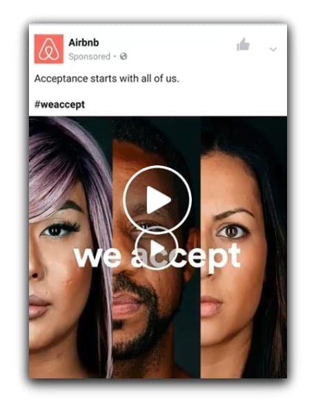
5. Dollar Shave Club’s “His/Her” ad

Dollar Shave Club is an American company that manufactures and sells shaving and other grooming products.
One of the special things about this brand is that they don’t produce separate razors for men and women.
They strongly believe that women don’t have to pay more for “pink” products, and that their products are suitable for both genders. They’ve delivered this message through several of their ads.
The image ad above is a great example.
The way they’ve delivered that message speaks volumes for their creativity. They’ve managed to explain the idea by simply using 2 words (“His” and “Her”) and the same image twice.
To summarize, here’s what we like the most about this ad:
- Image – their product, placed on a neutral background, makes for the perfect image.
- Concept – instead of taking separate images for HIS and HER, used the same image twice to convey the message.
6. Dollar Shave Club’s “Don’t overpay for pink” ad

Next on our list of great Facebook ad examples is another masterpiece by Dollar Shave Club.
Conveying the same message, the ad features a high-quality image of a woman using their “unisex” razor to shave her legs. Without using any words, they’ve managed to convey their message effectively.
Apart from the image, the text urges women to not “overpay for pink” products and invites them to try the “Club.”
They’ve taken a rare approach and have specifically targeted women for a “male” product, allowing them to capitalize on a flaw in the market.
To summarize, here’s what we like the most about this ad:
- Copy – eye-opening, concise, and goes with the brand.
- Image – a perfect shot conveying the perfect message i.e. women using unisex razors that are cheaper than pink ones.
7. GlobeIn’s “40% off” ad

GlobeIn sells handmade crafts that are procured from different regions and then delivered to your doorstep.
This elegant and eye-catching ad does an excellent job of promoting their offer on “The Artisan Box.”
First of all, the image has a clean design and displays different handmade goods.
Secondly, the placement of the on-image copy, “40% OFF,” is a textbook example of promoting offers the right way. The font is prominent enough to make anyone stop and check out the ad.
The main lesson here is that if you’re promoting an offer, make sure it’s visible right away.
To summarize, here’s what we like the most about this ad:
- Image and copy – clean design, with perfect size and placement of the copy.
8. Amazon’s “Black Friday” ad

When discussing Ecommerce Facebook ad examples, it’d be weird not to include Amazon.
Out of all the ads by Amazon, this one (about their Black Friday sales) made it to the list.
The choice of attractive colors, together with just the right amount of white space, and of course, copy that respects the 20% rule, make the image perfect in every sense.
They’ve also shown a product to attract a specific target audience – for example, this particular ad was targeted towards cat owners.
The key lesson here is that if you have many best-selling products, you could create multiple, attractive ads for your campaign, each perfectly crafted around a specific product.
To summarize, here’s what we like the most about this ad:
- Image – the right balance of whitespace, colors, and copy.
- Targeting – although the ad primarily promotes the Black Friday sale, it targets cat owners – a tried-and-tested practice for standard image ads if you’re selling a broad range of products.
9. Floyd’s “bed frame” ad

Floyd specializes in making home furniture, lamps, and hardware. They’re best known for their sturdy and stylish bed frames.
This simple image ad for their bed frame doesn’t have a lot going on. And that’s exactly what makes it perfect.
Apart from the bed itself, they’ve also carefully placed their side tables to complete the image.
But the image isn’t the most interesting part about this ad – it’s the text.
They’ve written it from the perspective of the product (i.e. the bed frame) itself, and have creatively mentioned how convenient it is to explore their product. Simple, clever, and to the point.
To summarize, here’s what we like the most about this ad:
- Image – if you have a product that compliments the main one (such as the side table in this case), don’t hesitate to subtly place it in the image.
- Text – experiment with the copy: “speak” on behalf of your products and use simple & subtle humor.
10. Nike’s “custom shoes” carousel ad
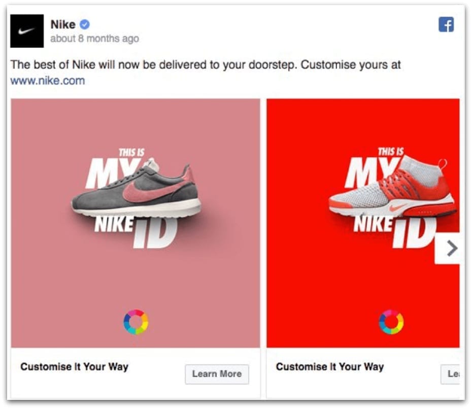
Nike’s one of those brands that doesn’t need a formal introduction.
Aside from their shoes, they’re also known for their eye-catching online ads.
This particular carousel ad for their custom shoe’s service caught our attention – and for good reason.
Every card has a different background color that matches with the featured (custom) sneaker, and the tagline, “THIS IS MY NIKE ID” is presented in well-placed and visually-appealing typography.
There’s also a color wheel at the bottom to inform customers they can customize their sneakers, without taking up much space, or without using any more text in the image itself.
To summarize, here’s what we like the most about this ad:
- Variety – each card features a different color and product, which not only is the best practice for carousel ads but also delivers the main message effectively.
- Typography – creative placement of text that takes up minimal space.
11. Nike’s “Fast Pack” ad

For a brand that makes amazing ads, Nike deserves to be mentioned twice on this list.
This ad for their Fast Pack shoes is difficult to miss while scrolling down your Facebook timeline.
The image has a strong gradient of red, dark pink, and teal, with one of their sneakers stealing the spotlight – perfect for capturing attention.
On the left, the image of a small group of young people appeals to their target audience, with the Nike logo to perfect the ad.
The headline is short and immediately tells that the ad is for the Fast Pack series.
To summarize, here’s what we like the most about this ad:
- Color – strong gradient that captures attention.
- Headline – to-the-point and relevant.
Best SaaS Facebook Ad Examples
12. Shopify’s “motivational” ad
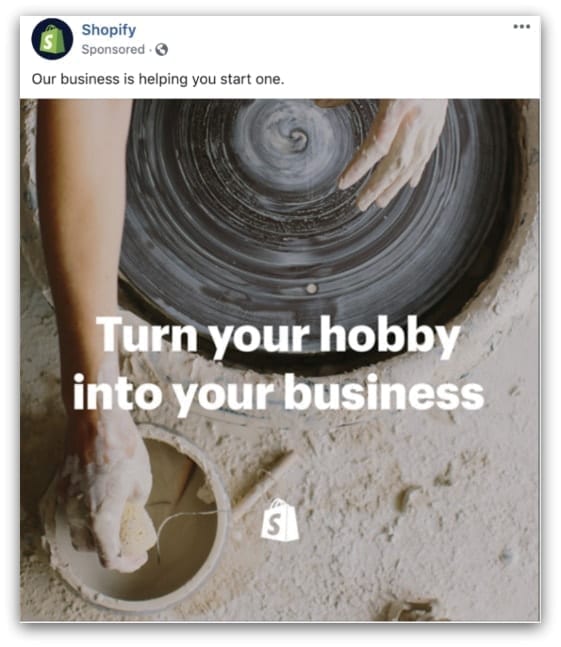
You can never go wrong with a motivational ad, especially if you offer a software for ecommerce businesses.
That’s probably what the folks running the campaigns for Shopify aimed for while creating this ad.
The simple copy, “Turn your hobby into your business,” written over a vague yet captivating image makes for an amazing ad.
To summarize, here’s what we like the most about this ad:
- Copy – the motivational copy is the hero of this ad.
- Imagery – the cropped photo of a potter at work makes for great visuals.
13. SurveyMonkey’s “incentive” ad

Taking surveys isn’t easy. At times, you need to give your respondents a little incentive to contribute to your research.
That’s the whole idea behind SurveyMonkey.
This particular ad that invites users to participate in surveys for a chance to win a PlayStation gift card worth $300, and other prizes, is an excellent example of simple design.
In this vector illustration, all you can see is a hand and a gift card – and no text (except for the words “GIFT CARD”).
This goes to show that with the right visuals, you don’t need to add additional text to sell whatever it is you’re offering. It also shows why graphic design is important for any business.
To summarize, here’s what we like the most about this ad:
- Simplicity – the image doesn’t include anything except for illustrations.
- Headline – the headline, “Want a $300 PlayStation Gift Card?” is both concise and attractive to targeted users.
14. Asana’s “social proof” ad

Next on our list of best SaaS Facebook ad examples is this impactful ad by Asana.
There’s no better way to earn the trust of your target audience than to provide social proof. That’s what Asana did here.
They took a short testimonial from one of their clients and used it as the image text (respecting the 20% rule in the process).
Another great thing about this ad is that they combined the powers of social proof and illustrations (that represent productivity and their dashboard) to create something that’s both visually-appealing and genuine.
To summarize, here’s what we like the most about this ad:
- Social proof – utilized a short testimonial as ad copy.
- Illustrations – flat illustrations are a fun way to deliver messages.
15. Hotjar’s “curious” ad

Hotjar is a platform that offers advanced web analytics tools. It provides tools like heat maps, visitor recordings, and conversion funnels, to name a few.
With so many technical features to offer, you’d think that they’d opt for a video, slideshow, carousel, or even an Instant Experience ad to showcase them.
In the ad shown above, they decided to keep things simple and stick with a good ol’ image.
To make it stand out, they used a simple illustration of a webmaster/digital marketer examining a website with Hotjar.
The lesson here is that no matter how complicated your product is, you can always find a simple and highly effective way to promote it.
To summarize, here’s what we like the most about this ad:
- Illustration – a simple, yet effective way of explaining what Hotjar is.
16. DocuSign’s “sign” ad

DocuSign is a cloud-based e-signature service that facilitates online agreements, contracts, and sales.
The two selling points of the service are that it expedites important agreements and reduces the chances of errors.
Those are the exact things that they’ve tried to sell through this image ad.
The black and white side-pose headshot on a vibrant green background gives the image a retro feel.
In the copy “Design faster processes,” they’ve written the letters that spell “sign” in bold – a subtle way to promote their e-signature services without even using the word “sign.”
The lesson here is that you can also use simple font-formatting to deliver your message.
To summarize, here’s what we like the most about this ad:
- Typography – creative font format that promotes their e-signature services.
- Design – the perfect blend of contemporary and retro styles, making the ad highly attractive.
17. Melio’s “check fraud” ad

Melio acts as a bridge between small businesses and their vendors.
Businesses have the option of paying either through bank transfers or cards (even where cards aren’t accepted). This adds an additional layer of security that protects both parties.
The brilliant ad needs no explanation, as the thumb-stopping illustrations deliver the message with ease.
The simple vectors icons show that with Melio, you can guarantee safe and secure transactions and avoid fraudulent activity.
To summarize, here’s what we like the most about this ad:
- Design – the message was effectively delivered through simple icons (and no copy).
18. Slack’s “unicorn” ad

Slack is another team-collaboration platform, similar to Asana.
A big benefit of using this cloud-based collaboration software is that it helps businesses reduce the need to call in for their daily meetings, which results in higher productivity.
Unlike Asana’s ad – which used flat illustrations to demonstrate that fact – the folks at Slack took the creativity up a notch and produced this party of colors.
The image of a woman riding a cartoon unicorn, with the copy “What it feels like to sit in 25% fewer meetings” is a great way to sell the service.
To summarize, here’s what we like the most about this ad:
- Creativity – instead of choosing between illustrations or real images, why not creatively merge both?
- Copy – perfectly complements the illustration/image and sells the business.
19. SurveyMonkey’s “GoPro” ad
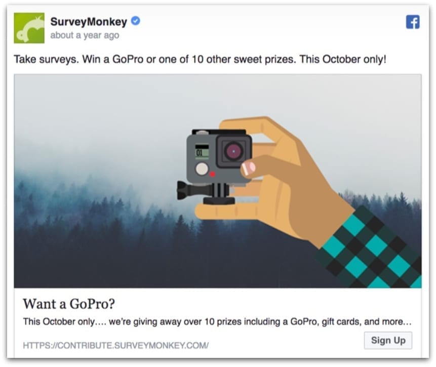
When it comes to ads featuring custom illustrations, SurveyMonkey always takes the cake.
This image ad is yet another example of why you don’t always need to add text to an image/video.
Like the previously mentioned ad, this one also invites users to take part in their surveys for a chance to win an exciting prize. This time, they are giving away a GoPro.
There is a solid attention to detail in this illustration, especially if you consider the gloomy forest in the background giving off vibes of fall (yes, they ran this ad in October).
Once again, they’ve kept the headline easy to understand – “Want a GoPro?”
To summarize, here’s what we like the most about this ad:
- Attention-to-detail – the illustration matches the description, time of year, and depicts the offer.
20. Gusto’s “easy payroll” carousel ad

Question – what’s one of the best ways to make a carousel ad for your SaaS?
Answer – create a custom illustration for each card to show its benefits.
Gusto (an HR, payroll, and benefits platform) followed the same approach while creating this ad.
The attractive and colorful flat illustrations creatively showcase what the platform has to offer.
For example, the first card which says, “4 out of 5 users reduce payroll errors,” features an image of 5 pencils that represent said users. Apart from the illustrations, the use of statistics like “9 out of 10” and “4 out of 5” gives credibility to the advertiser.
To summarize, here’s what we like the most about this ad:
- Illustrations – Colorful, creative, and relevant.
- Text – use of statistics creates a sense of trust.
21. Grammarly’s “integration” ad

Almost everyone knows about Grammarly – a helpful tool for those who like error-less text.
The software seamlessly integrates with three major writing platforms – Gmail, Microsoft Word, and Outlook.
This simple and on-point ad promotes that capability with a one-liner, “Write flawlessly everywhere,” followed by the logos of the above-mentioned platforms – placed on a light gray and white gradient.
To summarize, here’s what we like the most about this ad:
- Simplicity – your ad’s design doesn’t have to be complicated. Sometimes, simplicity is better.
22. Expensify’s “instructive” carousel ad

Marketers tend to forget that they can also use the carousel format to create a mini tutorial slideshow.
The folks at Expensify – a receipt scanning and expense management service – certainly didn’t forget that while making this ad.
By using a handful of images, they demonstrated how easy it is to use their app.
Apart from the execution, the vibrant colors of the images would make anyone stop and scroll through the entire carousel.
To summarize, here’s what we like the most about this ad:
- Choice of format – the carousel format is an appropriate choice for instructive ads such as this one.
- Images – high quality, vibrant images that demand attention.
23. Intercom’s “CTA illusion” ad
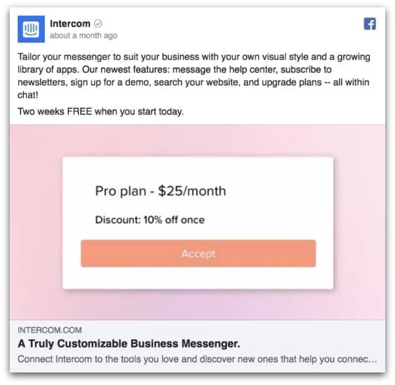
Intercom offers a customizable messaging service for businesses to interact with their customers.
In this Facebook ad, they’ve done something rather interesting.
Instead of writing a standard one-liner for their service, they’ve displayed the price of their pro plan along with a discount, and have placed a rectangle underneath that looks like a CTA – making the image seem like an actual CTA button.
This ad is based on the classic “differentiation by price” principle, which works well if you have many competitors offering the same features.
The “CTA button illusion” also increases the chances of getting more clicks.
To summarize, here’s what we like the most about this ad:
- Design – the illusion of the CTA button may result in more clicks.
- Copy – instead of something snappy or sales-y, they’ve simply written their pricing plan.
24. Quip’s “get sh*t done” ad
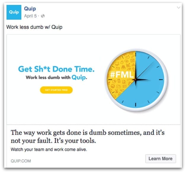
Quip is a team collaboration tool that lets users collaborate on critical business documents in real-time.
In this “clean-looking” ad, they’ve brilliantly summarized what their platform has to offer – productivity and the ability to get “stuff” done on time.
The yellow part of the eye-catching clock represents the amount of time employees waste by not using the right set of tools.
The idea here is that with Quip, businesses can save a lot of time by working “less dumb.”
Everything, from the top text to the description, is concise and impactful.
To summarize, here’s what we like the most about this ad:
- Illustration – a perfect representation of what Quip has to offer (i.e. efficiency).
- Copy, Text, headline, & description – explains the big idea behind the ad flawlessly.
25. Infusionsoft’s “Email marketing” ad

Infusionsoft (now known as “Keap”) is a sales and email marketing software.
In this simple and eye-catching Facebook ad, they’ve promoted one of their guides on email marketing for real estate professionals.
The image has a dark background, with a concise copy that’s written in a light color and includes Infusionsoft’s logo at the bottom-right corner.
Overall, the image is clean, simple, and attractive.
To summarize, here’s what we like the most about this ad:
- Image – perfect choice of colors with appropriate placements of text and logo.
Best Digital Marketing Facebook Ad Examples
26. Pay On Performance’s “performance-based” ad

Pay On Performance was an Australian SEO service. Their main selling point was that they only accepted payments from clients if they saw visible progress.
This image ad promotes that same USP.
The use of vectors, background color, and typography is a textbook example of good social media graphic design.
Concise (yet, bold in nature) copy is attractive enough to garner a good amount of clicks.
To summarize, here’s what we like the most about this ad:
- Design – attractive, with the right balance of color, text, and shapes.
- Copy – concise and eye-opening.
27. Design Pickle’s “digital design library” ad
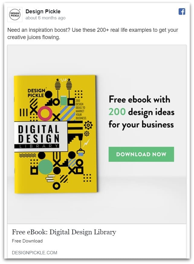
Designing great Facebook ads is one of our many passions, which is why it only makes sense to include this ad on our list.
To promote our free digital design library eBook containing 200 design ideas, we created this simple, yet highly effective image ad.
The placement of the yellow book against a light background, together with some copy and a “CTA button” resulted in a striking asset.
The key takeaways:
- If the product/object has strong colors, keep the background light.
- At times, you’re better off keeping your copy simple and to-the-point, rather than making it snappy.
Best Finance Facebook Ad Examples
28. IGH Insurance’s “smooth ride” ad

If there’s one thing that insurance companies try to sell, it’s the idea that you should live your life to the fullest.
That’s the straightforward concept behind this Facebook ad for IGH Insurance.
The “look ma – no hands!” ad features a colorful and captivating image of two bikers, riding their motorcycles without using their hands, which represents two things:
- Worry-free life
- A smooth health insurance process
The copy has been highlighted with rectangular shapes, making the ad clean and crisp.
To summarize, here’s what we like the most about this ad:
- Image – high-resolution picture that does a great job of subtly delivering the message.
- Use of graphics – clever highlight of the copy.
29. Quilt’s “instant insurance” ad

Quilt initially started out as a service that provided insurance fast.
This ad, which shows a smartphone with the stopwatch open in one panel, and a calendar in the other, is a brilliant execution of the ‘fast’ benefit.
In the right panel, the stopwatch app represents that it only takes 10 minutes to get insurance coverage with Quilt, whereas with other services, it could take up to months.
This ad is simple, clean, and effective. All they’ve used are two stock photos and some text.
To summarize, here’s what we like the most about this ad:
- Execution – they’ve delivered the idea of “instant insurance coverage” quite well.
30. Ladder “dynamic insurance” ad

Ladder is an insurance company that specializes in providing dynamic insurance i.e. coverage that keeps changing from time to time, depending on your circumstances.
In this powerful image ad, they’ve kept the concept easy to understand – caring for your loved ones.
Who knew that a black and white stock image of a father and her daughter, together with some text and a colored logo would look great?
To summarize, here’s what we like the most about this ad:
- Image – the black and white stock photo goes remarkably well with the logo and copy.
31. GEICO’s “pun” ad

GEICO is an insurance company that specializes in auto insurance.
Apparently, they also specialize in puns, which is obvious from this ad.
The comical image of a clock with wings (which is completely unrelated to car insurance) is a take on “time flies.”
Anyone scrolling down their timeline would definitely stop to appreciate this pun, only to realize that it was posted by an insurance company.
The top-text, “Puns are bad, but saving money on car insurance is GREAT” clears things up.
If that’s not enough, the headline, “Knead more dough? Save $ with GEICO” is another pun that delivers the message.
The take-home message – it’s okay to use humor once in a while to market your products.
To summarize, here’s what we like the most about this ad:
- Humor & curiosity – creative visualization of well-known puns.
32. Root Insurance’s “end-to-end” ad

It looks like marketers at car insurance companies have a great sense of humor.
This ad by Root Insurance – a special car insurance company that models their rates on the basis of how you drive – is another example of a well-executed pun.
This clean and sleek ad shows a hatchback with no hood – a take on their “end-to-end” car insurance which could help their customers save up to 52%.
To summarize, here’s what we like the most about this ad:
- Humor & curiosity – like the last ad, this one demands attention through elements of intriguing humor.
33. PayPal’s “business in a box” ad

PayPal is a well-known payment merchant.
This particular ad is for “Business in a Box” – a single platform by PayPal for businesses to launch their e-commerce websites, manage payments, and deal with marketing.
The dark background is perfect for capturing attention, whereas the copy and the icon deliver the message perfectly.
To summarize, here’s what we like the most about this ad:
- Background – dark, eye-catching color.
- Icons & copy – beautifully explain the concept.
Free Template for launching your first Facebook Ad Campaign
We understand, that at times, it can be difficult to create a Facebook ad from scratch. To help our fellow designers, we’re offering this FREE Facebook ad template:
How To Launch Your First Facebook Ad Campaign
Download it today to kick start your creative process and craft the perfect ad!
Ending Note
And that concludes our list of 33 best Facebook ad examples.
We hope that you got the inspiration you needed to make your own engaging and appealing ads. Remember – you don’t need to spend thousands of $$$ to create the perfect ad. All you need is some inspiration, a little coffee to spur creative magic, and a clearly-defined goal.
If you’re still struggling to design an effective ad, get in touch with us today.