We’ve all been there: a Google search has led us to a hard-to-read website, and we quickly leave because that’s definitely not a trustworthy source.
As content creators, we can’t let that happen. In the Internet age, everyone has a voice. How do you stand out? Your font choice matters. It’s the difference between being perceived as an amateur or a professional.
This little cheat sheet uses fonts from the Google Fonts library — they’re free for commercial use, and they’re extremely easy to implement on your website. If you want something more unique and custom though, check out this 5-step Guide on Creating Your Own Font.

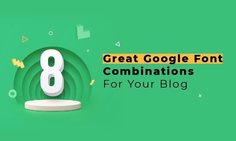
Here are 8 examples of Google Font combinations for your blog:
1. Libre Franklin + PT Serif
How does this pair manage to look so… so respectable? Well, both Libre Franklin and PT Serif are both modern interpretations of much older fonts: early 20th century Franklin Gothic from America, and 18th-century civil type made for the Cyrillic alphabet from Russia.

2. Alegreya Sans + Literata
Literata was designed with ebooks in mind: classy, rounded, and scalable. Alegreya Sans is a sans serif font with a special calligraphic flair. This is a friendly-looking, even feminine pair, great for personal, home-themed blogs.

Related Articles
7 Tips for Designing Promotional Flyers
Designer-Speak for Clients: Basic Design Principles
3. Arya + Zilla Slab
Arya is a beautifully striking and utilitarian sans serif. Zilla Slab is a modern slab serif that works pretty well as a body font, though you have to be careful that the text doesn’t get too small. Both fonts share a smooth but industrial vibe, making them a great combination.

4. Source Serif Pro + Source Serif Pro
Using just one font — yes, it works. Here we’re using Source Serif Pro Bold with Source Serif Pro Regular. Keeping your typography within the family means harmony, and doesn’t mean there can’t be contrast. For example, here the header and body are simply different weights and sizes.
Source Serif Pro is eye-friendly and highly legible; it’s a classic serif that reminds one more of old books than newsprints.

5. Literata + Alegreya Sans
A reverse of #2, here we’re using Literata as the header and Alegreya Sans as the body font. Alegreya’s tall, sassy characters combine style and legibility. This pair works great for brands that would like to project a more personable vibe.

6. Belleza + Source Sans Pro
Belleza is delicate and feminine, while Source Sans Pro is friendly and functional. Both fonts are clear and balanced, perfect for lifestyle or fashion editorials. Together, they speak of minimalism, lightness, and cleanliness.

7. Spinnaker + Overlock
Spinnaker is a French-travel-poster-inspired typeface, while Overlock is a lovely, rounded sans serif. Together, these fonts seem to speak of relaxation and long tropical cruises.
This combination looks great when Spinnaker is used in all caps, revealing its quirky, generous weights, but feel free to experiment. Also, Overlock really works best when the text is large enough to showcase its subtle curves, so don’t make it too small.

8. Courgette + Nunito
Courgette is a seemingly carefree but meticulously web-friendly script font. Nunito, while squat and round, remains elegantly readable. Both fonts have quirky characteristics, but they both have been carefully kept within the bounds of strict legibility. Use this combination for fun, kid-friendly publications.

There you go. We’ve done a little mixing and matching for you; feel free to take it further.
Ultimately, you don’t want readers to think too much about your fonts. As they become absorbed by reading your great content, they’ll forget your blog even has a font. But you still need great fonts as a visual pitch, a virtual handshake, in order to reel them in.
Never compromise these two things: readability and personality. Keep that in mind, and you’ll find it hard to get your fonts wrong. Happy hunting!